Let’s talk about how to choose your color palette and why it’s so much more than picking a few lovely colors that go with your style.
There is a lot of thought + mastery that goes into it, more than what you might think!
Color palettes are generally the most time-consuming procedure for my clients to approve. And I’ve observed a similar thread across many of my clients: they’re all overwhelmed with which colors to choose, and they either choose too many or don’t know what to choose at all!
Let me put things in perspective for you: picking a color palette has less to do with what colors you enjoy and more to do with what colors your ideal clientele will be drawn to. Yes, you want to pick a color scheme that you like and that represents you, but if you don’t think about it, your colors might convey the incorrect message, confuse, attract, sell, or repel your ideal clientele!
Psychology of Color Palettes
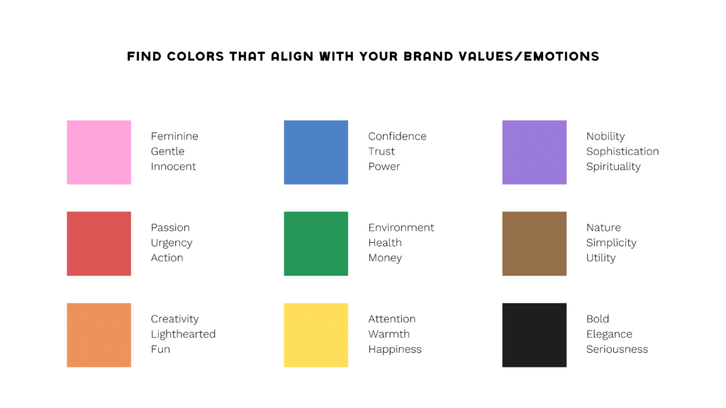
Brown, pink, and orange are among the colors used in my branding, and they all indicate confidence, fun, earthiness, compassion, bravery, femininity, friendliness, and success. Brown and pink are highly common colors in female-owned enterprises because they give out a lovely, soothing aura to their customers.
Take some time to think about who you’re attempting to attract and how you want them to feel when they interact with your brand. Before they even consider working with you, what feelings do you want them to experience? Protected? Elevated? Unique?
Check out this slide of a lesson from The Brief Collective that I taught about the Psychology of Color:

Using Mood Boards
Don’t worry if the color wheel perplexes you a little. Creating a mood board on Pinterest is one of the simplest ways to pick a color palette. Collect and pin photographs with colors you adore. Pinterest also has a huge selection of pre-made color palettes, which may be a good place to start figuring out what colors you like and how they work together. After you’ve created your mood board, you can import the photos into Canva, Over, or Photoshop and utilize the color choosing tool to extract the colors directly from the image.
If you want to build this out on Pinterest, here’s an example of what I’ve put together for a client.
Application in the Real World
Beyond your branding and digital assets, consider how you are going to tie it together IRL! If you are doing any brand photography (personal or product), you want it to go with your color palette for your brand as a whole. I have an entire post on high-quality brand photography and the importance of what goes behind it.
© Created by MB -Creative Agency 2024
